First impressions count, right? I think we all know that. But have you stopped to consider what first impression you might be presenting with your website?
Are you really representing you and your business at its very best?
If you're interested in exploring some ideas about how to improve your website, and therefore your online reputation, then keep reading.
So according to Psychological Science, it can take as little as 6 seconds for someone to form their first opinion of you. If you think that's daunting, then check this out...
According to research by Google, you're looking at even less time when it comes to your website. We're talking milliseconds, in fact, just 50ms.
As our eyes scan the home page for clues as to whether or not we want to hire that service or buy that product, we are taking in an awful lot of information and processing that.
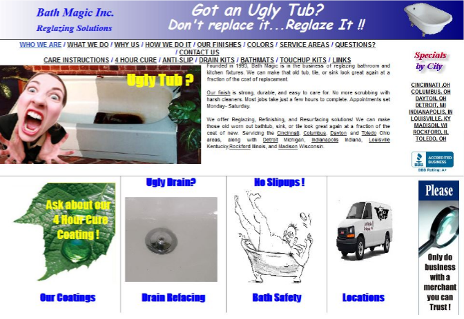
To help explain this further, I'm going to show a screenshot for a company specialising in bath and kitchen reglazing. Just to be niche.
So... what are your first impressions?
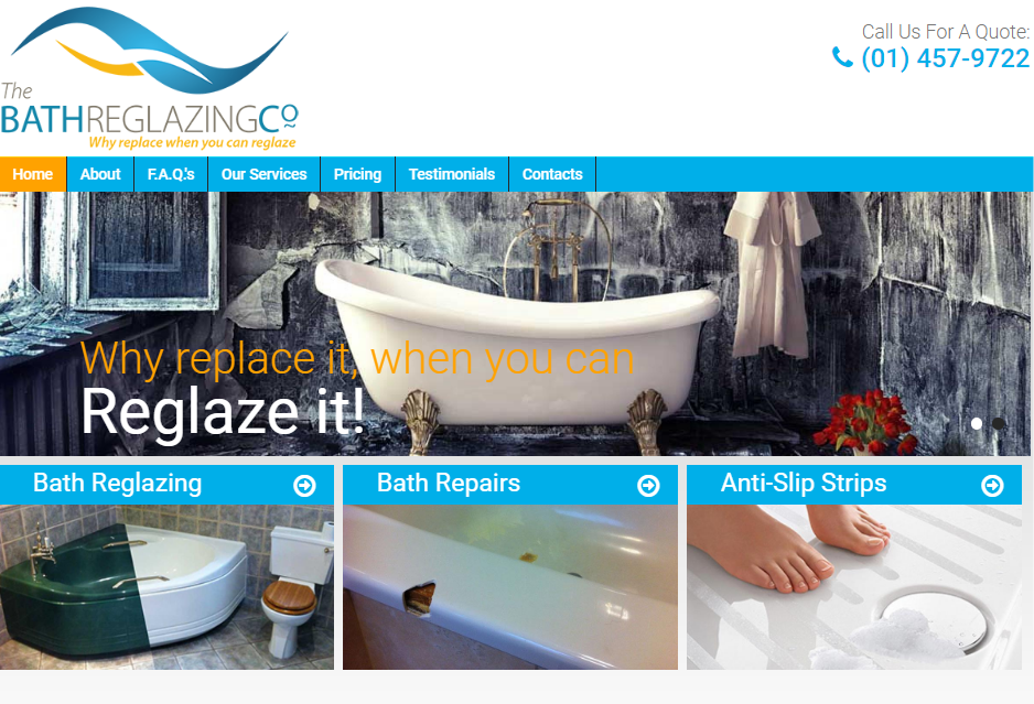
By contrast, here is another company offering the same service.
Which did you prefer? Which did you find easier to absorb and understand? Which company would you put your faith in?
My guess is it was probably the second one, and for a whole host of reasons, I imagine.
But simply put, they probably lead back to one main point – the impression that you got about how professional their service was. And that was because they had a more professional looking website showcasing it.
We get very little information about the relative costs, the customer reviews, the years of expertise, and so on, but already, from just a quick glance at the homepage, those potential reglazing customers are already deciding whether they even want to continue to explore the rest of the site and find out.
So what can you do to improve your website?
I'm going to share 3 tips with you, but I think they're all pretty vital, and they're things you can consider doing right away.
1. How does it look
You obviously want to try and put together a design that looks modern, sleek and professional, and that goes for pretty much whatever service, industry or products you're selling.
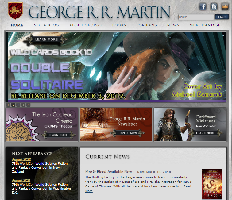
You don't want it to look like it was created twenty years ago, like this one...
If you're really paying attention, you'll notice that was George R R Martin's website, the author of Game of Thrones. And that particular website was functional at least until 2011.
It certainly doesn't match the kind of quality of his work, I don't think.
His site has since been overhauled and now looks like this:
A little better, I think you'd agree.
So what's key to a good looking website?
Well, users should know who you are and what you do right away. Preferably within that very narrow 50ms I spoke about earlier, but just do your best with that!
According to a study by Nielsen Norman Group, most web users eye-tracking movements follow roughly an F-shape. That is, starting top left, they scan across, then they drop down and scan across again, and then they go back to the top and scan down the left hand side.
Interesting, right?
So that's worth bearing in mind when looking at your layout and what important information or graphics you want put where, such as your logo, your company name, any images, and so on.
Also, you can use this idea in a sort of counteracting way, so if you want to draw someone deliberately away from that pattern, then you can use coloured buttons or boxes or graphics to actively draw them to what you want them to see.
And this also leads onto more of a general rule, especially with your home page, and that's 'less is more'.
Well, that's not strictly true, but you do need to consider what you think is essential to help improve that first impression, and what can be put somewhere else on the website, to find later on.
Global Reach, HubSpot and Impact BND all suggest different ideas about what makes a good homepage, and I've pulled them together to give you a kind of overview, which you can find and download as a PDF at the bottom of the main advice area of my website.
Now this probably shouldn't serve as a strict checklist, but perhaps you can use it to review your own current website, or to think about what you might want from a new one.
And again, it's important to consider how this all fits together visually, so don't just shove all this onto the homepage for the sake of it. See what works for you.
And that leads us onto the next point...
2. What does it do
So as I mentioned in my first blog post, 'Do I still need a website for my business these days?', your website is your best 'information destination'.
With the social media platforms constantly changing their algorithms and sometimes making things extra tricky for us in terms of getting seen, your website should be the one place that people can consistently access.
And once they open your website, what will they find?
Well, that's really up to you.
I tend to offer a 4 page package to my clients, so that's the Home Page, an About page, a Services page, and a Contact page.
But you've also got the opportunity for other elements, depending on how the site is designed, so that can include, for example, blogs, which are a great way to talk about the industry you're in and share your knowledge (ahem...)
Videos do a similar thing, only visually, and both of these really help drive traffic to your site too. According to Seo Tribunal, companies who blog receive 97% more links to their website.
And with YouTube being the second biggest search engine after Google, it makes sense to get yourself on that platform too.
(You can subscribe to my channel and watch my Digital Dilemma series here: shorturl.at/qDEMZ)
You can also build an e-commerce website, which allows people to buy products from you directly, rather than through a third party such as eBay or Etsy, so that's great for some businesses.
The best thing about all of this is you can design the website for your needs and requirements, and those of your customers, rather than trying to fit yourself into the limited parameters of your Instagram bio or your Facebook profile page.
And lastly, we need to look at...
3. How does it run
So this is the functionality of your website.
Back to our original statistics about how long it takes to make a first impression.
Research by Google found that 53% of mobile users abandon sites that take over 3 seconds to load.
So it's crucial that once you've created this incredible website, it loads quick enough to grab people's attention before they backtrack and go somewhere else.
Lots of website packages also feature mobile optimisation, which is really helpful with this.
It also ensures a professional-looking continuity between the desktop version and the mobile version.
Worth considering when around 40% of people search only using a smartphone, according to TechJury.
I've given you a lot to think about so please don't be put off. It all comes back to that simple compare and contrast I showed you earlier.
What impression do you want to give to people?
Having an up-to-date website leads people to forming a more positive first impression of you.
So if you're thinking of overhauling your current website, or starting a brand new one from scratch, hopefully these tips and ideas can help you to present your most professional digital self.
Still seeking more advice? You can read my previous blogs by clicking here: https://www.clairescottdigital.com/blog. Or you can watch my Digital Dilemma videos over on YouTube.


Comments